

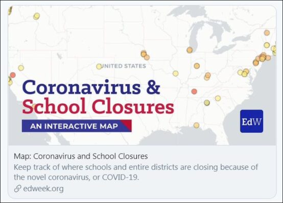
As the COVID-19 pandemic tightened its grip on the world of education, the Education Week map became a powerful tool to show the overwhelming impact of the virus.
In early March, Education Week jumped ahead of the news and began creating what has become a go-to resource for education reporters – a map plotting coronavirus-related school closures across the country.
The effort became nearly a 24/7 operation. Every reporter and editor signed up for three-hour shifts to work on the map, so it was updated from 7 a.m. until late in the evening.
“It’s everybody. All the reporters, all the editors, all of the web team, visuals. Nobody on the news staff hasn’t been involved in updating the map at some point,” EdWeek’s Editor-in-Chief Scott Montgomery told The Grade in a phone interview.
But the payoff was enormous. “It became clear that this basic question of whether or not schools were going to be open was driving the [coronavirus] story,” said Montgomery.
As the pandemic tightened its grip on the world of education, the EdWeek map became a powerful tool to show the overwhelming impact of the virus. It was an immediate way to demonstrate staggering news, much like The New York Times was able to capture and personalize the enormity of 9/11 with daily photos and snapshots of the lives of the victims of the attacks.
Since its launch, Education Week’s map has been used by major media, including The New York Times, The Washington Post, NBC News, NPR, and U.S. News & World Report.

The result of brainstorming
The birth of the map, which launched March 6, grew out of coverage brainstorming. Lesli Maxwell, the publication’s assistant managing editor in charge of the site’s coronavirus coverage, put out a call to the newsroom for ideas. Library Director Holly Peele and librarian Maya Riser-Kositsky pitched the idea, Montgomery said.
“They said, ‘What if we try to track all the school closings?’ which at the time we thought was a thing you could do. We thought if this gets rolling, could we keep up?” Montgomery recalled.
The library director and librarian worked with the design team to build a map and scoured news stories and websites to start plotting closures. As the site launched, people emailed updates or commented on the map with more closings as they happened.
Within the first week, federal agencies called wanting to know where the data came from, so EdWeek made the spreadsheet available in a downloadable form.
“Very quickly it became clear that people were craving this type of basic information,” Montgomery said. “We realized we were going to need more resources.”

The map is an invaluable tool for education journalists, said Lauren Camera, senior education writer for U.S. News & World Report, who noted she had relied on the map for nearly every story she had written in the last three weeks.
“Education Week is doing education reporters — and the country — an incredible service by tallying school closures in the U.S.,” Camera told The Grade via email.
The graphic element helps reporters and readers understand the sheer extent of the school closures that have swept the nation, growing from a trickle to a torrent.
“This is something that’s never happened in the history of the U.S.,” Camera said. “For more than 55 million children to be out of school, that’s something we’ve never had to visualize before. So to see it on a map helps people understand the enormity of the situation.”
NPR’s Cory Turner offered his appreciation via Twitter. “This map has been a HUGE help, and you’ll hear nothing but gratitude from me. It’s been shared and relied upon so widely, I can’t imagine the past few weeks w/o it.”
The map has also helped educational leaders track closures as they mull their course of action. In its “Coronavirus (COVID-19) Guidance for Schools,” the National Association of Independent Schools (NAIS) links to EdWeek’s map.
Defining “closed”
Since its launch, the color-coded map has evolved, adding dates for how long each closure is going to last, and breaking out the information into animated graphs.
Early in March, some systems and individual schools were only scheduled to close for a few days. Some had plans to reopen after spring break. The map reflected those changes, eventually color coding the states by month to reflect when they planned to reopen.
However, while many schools had physically emptied the building, students had shifted to virtual learning. This online educational shift, which varies by state and district, has not yet been noted in the map as of March 30.
“ ‘Closed’ means a bunch of different things,” noted The Grade’s Alexander Russo in a March 25 column. “What we now desperately need to know is which states and districts have reopened through other means (virtual and otherwise), and which remain ‘closed closed.’ ”
EdWeek’s Montgomery noted that a map makes sense when the basic question is whether schools are open or closed.
“The further we get away from that, the more we have to think about what other ways we can display the information,” he said. “If there’s a point where the map no longer makes sense, then we’ll do something else.”
With schools turning to online learning, it’s hard to display that information simply with a map, he said. Schools often make district-level or even school-level decisions about online learning
“And how they define online curriculum and true online learning is going to vary from place to place,” he said. “And nuances are a very difficult thing to create visually.”

At least one other site has added that information about remote learning. The Center on Reinventing Public Education (CRPE) has developed a database with detailed school closure information. It doesn’t have an easy-to-follow map, but it does include how each district is managing closures with specifics on district learning plans and student support, including scheduled launch dates for online learning.
CRPE is based in Seattle, which initially was home to the largest coronavirus outbreak in the United States. Editorial Director Travis Pillow said they saw that some school systems quickly prepared for remote learning while others moved slowly, paralyzed by the challenges.
“The idea behind the database is to provide a snapshot of how school systems all over the country are responding to the current crisis,” Pillow told The Grade via email.
Hopefully, school districts can use the information to see what they can do and find solutions to common issues, he added.
“This is uncharted territory for everyone, so we believe transparency about what different school systems are doing is going to be critical to enable the kinds of problem-solving that will be necessary to overcome this crisis,” Pillow said.
ABOUT THE AUTHOR

Mary Jo DiLonardo
MARY JO DiLONARDO has worked in print, online, and broadcast journalism for more than 25 years. She has covered a wide range of subjects including education, health, and science.


