

Chalkbeat guru Kae Petrin shows how any education team can use dataviz to sharpen coverage and bring in readers
By Kae Petrin
The COVID-19 pandemic has given education reporters what feels like a firehose of new data.
How can reporters decide what’s important? How can they highlight differences among schools, students, or districts? And how can newsrooms find new ways to communicate that to our audiences?
Visual journalism can offer a great answer to these questions. A well-crafted data visualization can help both reporters and readers see trends.
In-house graphics can also be a valuable fact-checking tool for districts and government reports, showing how one experience or outcome compares to another.
|

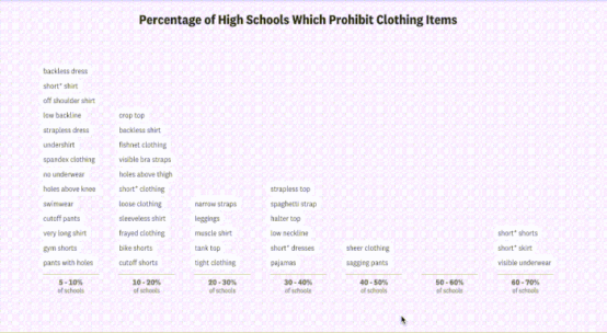
Above: An ambitious example of visual journalism.
Often, when people think of “visual journalism,” they jump to impressive interactive apps like this scrollytelling piece from The Pudding, which analyzes trends in school dress codes nationwide. It parses nearly 500 dress code policies to quantify the language and framing, then uses keywords to turn vague policies into tangible charts and graphs. It’s a fantastic piece of journalism.
Apps like this can require a large team of editors, writers, and analysts to produce.
But you don’t need a multi-person data team to produce compelling visual journalism.
Smaller-scale interactives, searchable tables, and inline charts or maps are all powerful tools with lower time-cost and technological requirements.

Above: Flowcharts can simplify complicated policies by walking readers through the variables that matter most.
When New York City public schools released new, complicated and rapidly changing COVID-19 protocols, Chalkbeat published a flowchart (above) to help parents determine whether their children had to quarantine.
(Here’s more on how and why we created that tool, which can be adapted to cover any complicated topic that involves multiple branching decision paths.)
Visual storytelling can help illustrate relationships between trends that may be intuitive to reporters but harder to describe in words, observed my colleague Cam Rodriguez.
“Not everyone is familiar with recognizing trends and patterns that might exist within those datasets, or they might not have the ability to monitor things over time,” Rodriguez says.
Data viz can do this for readers, without asking them to imagine complicated comparisons for themselves.
Data viz can also “break from that typical mold of education reporting on a school board meeting,” Rodriguez adds, to offer meaningful context on the figures being discussed – and offer readers a nice visual break in the middle of a text-heavy story that might deal with complicated policies.

Above: Interactive tables can allow readers to sort, search, and filter for the data that most interests them.
Audiences are also increasingly interested in seeking data that’s personalized to their own district and school.
Lookup tables can be a surprisingly effective way to let audiences do that. Take this one built by EdWeek Creative Director Laura Baker to supplement an Associated Press story on nationwide ESSER fund distribution.
This table has a few advantages: it’s searchable, it’s national, and it digs down to the district level, so readers can look up the data that’s most relevant to them.
And it also adds an extra contextual step: it calculates the average COVID relief allotted per pupil, then notes whether the COVID funding is higher or lower than the district spends on average.
Though the analytics for a table like this can get complicated, the tables themselves are often quick to create and easy for audiences to understand.

Above: These maps translate metrics used to make opaque legal decisions into geographic landscapes familiar to their audience to explain why and how policy changes are being made.
A series of maps from the San Francisco Chronicle also makes an excellent case for the power of data viz to add geographic context.
Maps can be notoriously misleading, but this series from data visualization developer Nami Sumida thoughtfully illustrates school-level and census-block-level data to illustrate the demographic trends officials are using to justify a new enrollment policy intended to diversify schools. It visually explains the reasoning behind a policy that will affect readers, but that feels opaque and complicated in text.
In a collaboration between data editor MaryJo Webster and director of graphics and data visuals C.J. Sinner, the Minneapolis Star Tribune created this series of charts on how enrollment has changed during the pandemic in Minnesota public schools.
These charts have a few great features: a simple over-time comparison illustrates how enrollment has changed throughout the pandemic. It also contextualizes who is leaving and where students might be going when they leave the district. As a series of four, each chart adds valuable context quickly and efficiently.

Above: Straightforward charts can show trends over time and illustrate proportions quickly, without asking readers to juggle percentages and proportions in their heads.
Each chart also emphasizes a different facet of the relevant trends, for a series that paints a larger picture. “Our audience is not living and breathing education data, so I’m a big believer that simple is better – show one thing at a time,” Sinner says.
Visualizing data with an exploratory mindset can also help reporters see where stories might be hidden in huge datasets.
Visualizing data with an exploratory mindset can also help reporters see where stories might be hidden in huge datasets.
When Modern Healthcare data and analytics lead Tim Broderick worked with WBEZ back in 2015, he collaborated on a large-scale interactive that used school testing data – a story which can often emphasize schools’ failures – to highlight schools that were performing uniquely well.
Broderick said that when it came to reporting the story, it was hard to know where to start with schools represented as “thousands of dots” in a giant collection of data. Emphasizing successful schools through data viz helped reporters decide who to interview.
“We were able to identify the signals and the noise,” Broderick said.
Getting a handle on the data before you think about visualizing it is also helpful, according to St. Louis Public Radio education reporter Kate Grumke.
“I spent the summer obsessed with learning to scrape websites and do mapping, but it’s just been a basic spreadsheet that has been my bread and butter on this beat so far,” she says.
Right now, she’s thinking about how to visualize smaller-scale graphics for a series of stories on critical race theory in Missouri schools, where the “data” is a list of policy proposals and challenged books rather than a traditional large data set. The visual could become book covers or charts comparing keywords.
“It doesn’t have to be humongous numbers,” she says. “There are a handful of districts that are doing something. And it’s interesting because there are just a few of them.”
Smart ways to start doing data viz
The barrier to making effective graphics has never been lower, according to the Star Tribune’s Sinner. “There’s never been such a time when these free, easy-to-learn, accessible data tools have been available to journalists,” she says.
The Star Tribune’s data team often uses Datawrapper, a tool with a robust free plan that lets newsrooms make mobile-friendly graphics. Newsrooms around the country have picked it up, including my team at Chalkbeat. But there are also other established apps such as Tableau or Flourish, and open source tools built by newsrooms like the Los Angeles Times and NPR.
If you don’t have time or confidence to do it yourself, there are also many talented journalists with data, graphic design, and web development skills available for hire on contract, freelance, or full-time. But it’s also important to consider investing time and money toward training already data-savvy reporters who may be interested in learning visual skills. Investigative Reporters & Editors offers short, affordable workshops to beginners. The Data Visualization Society and OpenNews both host regular programming for reporters and managers doing more technical work in journalism. The Pudding and Datawrapper also publish excellent blog posts about their processes.
Four reporting guidelines
- For larger projects, don’t assign a deadline, and give yourself time to learn. “I fully encourage people to take on a daunting project that may stretch their skills, whether it be Excel, whether they want to learn to code and they want to learn how to make a bar chart with Datawrapper,” Broderick said.
- Don’t feel like you must start big. Simple can be more achievable – and do the job just as well. Sinner says she starts by asking, “Are we telling the right story to make the impact that we want? Or to get the information out that we want? Often, the small charts are just faster, easier, and more effective.”
- Look for regular, reliable datasets that may be reported similarly between schools, districts, and states. “Things are very different across beats – but graduation, demographics, and enrollment are often more or less consistent,” said Rodriguez. State and federal yearly reports can also be a good starting place.
- Use data viz to report, not just to tell stories. Start thinking about the data and how you could use it before you start reporting. Says Grumke, “Become familiar with the numbers that you have access to early on, because you might not immediately need them for a story. But if you know they exist, it’s going to be a lot quicker to pull them for whatever you’re working on.”
As soon as you start thinking about reporting as acquiring answers to a set of questions, then repeating that process with the exact same questions, you’ve turned your reporting into data. That’s why I started learning data viz: so many of my own stories focus on rules and regulations that can become data, if you think about them that way. Learning the best ways to show those connections just became the next logical step. The more I’ve done it, the more I’ve been encouraged by how audiences connect to news graphics and apps.
I see education news as a fertile place for creative data viz, and I especially hope to see more education stories that convert written policies into visually driven journalism – or put overlooked accountability numbers in front of more eyes.
Kae Petrin is a data and graphics reporter at Chalkbeat. Before that, they produced multimedia news at locally focused newsrooms in Missouri, where they covered everything from education to housing law. Find them on Twitter @petrinkae.
Previously from The Grade:
NYT School Data Visualization Dumbs Down Test Results
USA Today Teacher Story Illustrates Possibilities & Perils Of “Digital Storytelling”
Steal This School Segregation Story [Visualization]!
Innovation in education journalism: Experimentation and promise
ABOUT THE AUTHOR

The Grade
Launched in 2015, The Grade is a journalist-run effort to encourage high-quality coverage of K-12 education issues.
![Best Education Journalism Of The Week [BOTW] 04/9-15/2017](https://kappanonline.org/wp-content/themes/Extra/images/post-format-thumb-text.svg)


